STREET TAILS WEBSITE
UX RESEARCH, FIGMA, RESPONSIVENESS
OVERVIEW
Street Tails Animal Rescue, located in Philadelphia, takes a different approach to adoption: rescue dogs that have been waiting in other shelters for extended periods rather than capturing strays. Their focus is on emotional companionship, matching people with pets who need a second chance.
I volunteered with their dog walking program and experienced firsthand how genuinely the staff cares for each animal. That warmth influenced my redesign: a site that reflects their personality while making browsing and adopting pets straightforward and enjoyable.
GENERAL USERS

The shelter’s primary audience includes potential adopters, especially those looking for unique rescue experiences. Many visitors are local and come from nearby areas like Northern Liberties, where higher living costs often align with higher income levels. This demographic also includes potential donors, volunteers for dog-walking programs, pet owners, and foster providers.
THE PROBLEM
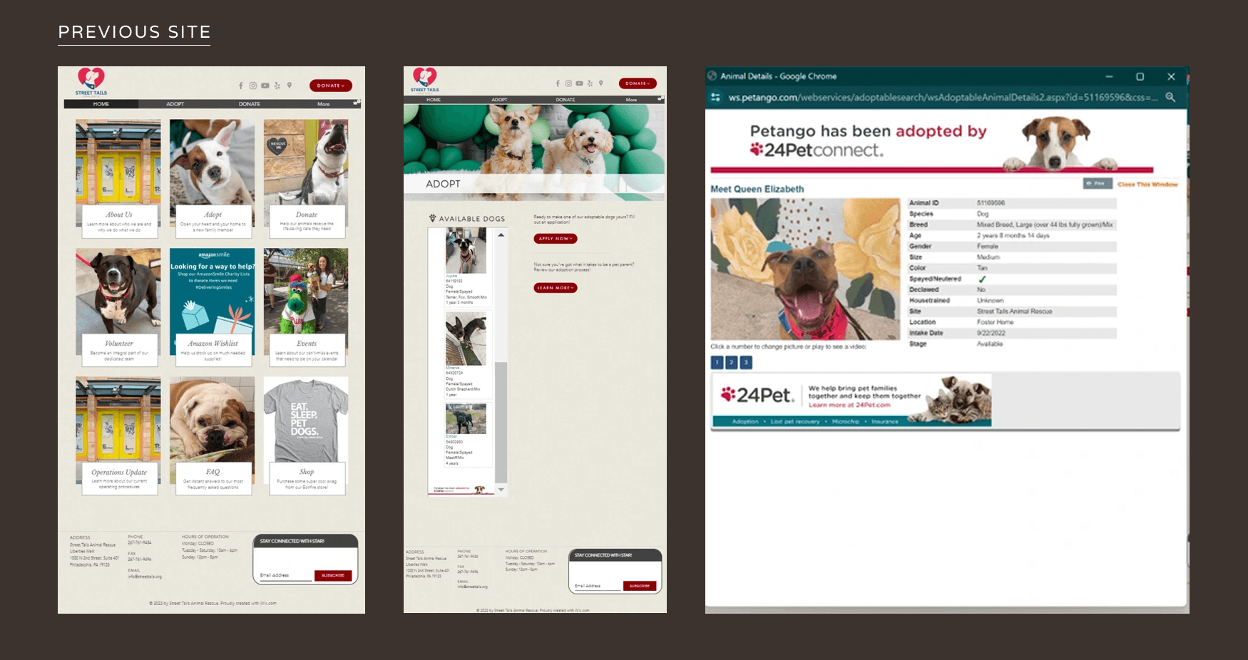
The current Street Tails site has a clean, homely color palette and centered layout that aids readability. However, the homepage relies heavily on a duplicated navigation bar, and critical information (Ex. pet backstories) lives on a separate site entirely. Without those personal details, there's no emotional hook for potential adopters. The navigation also overwhelms users with subcategories, and upcoming events are buried in an unexpected location, undermining their visibility.
WIREFRAMES
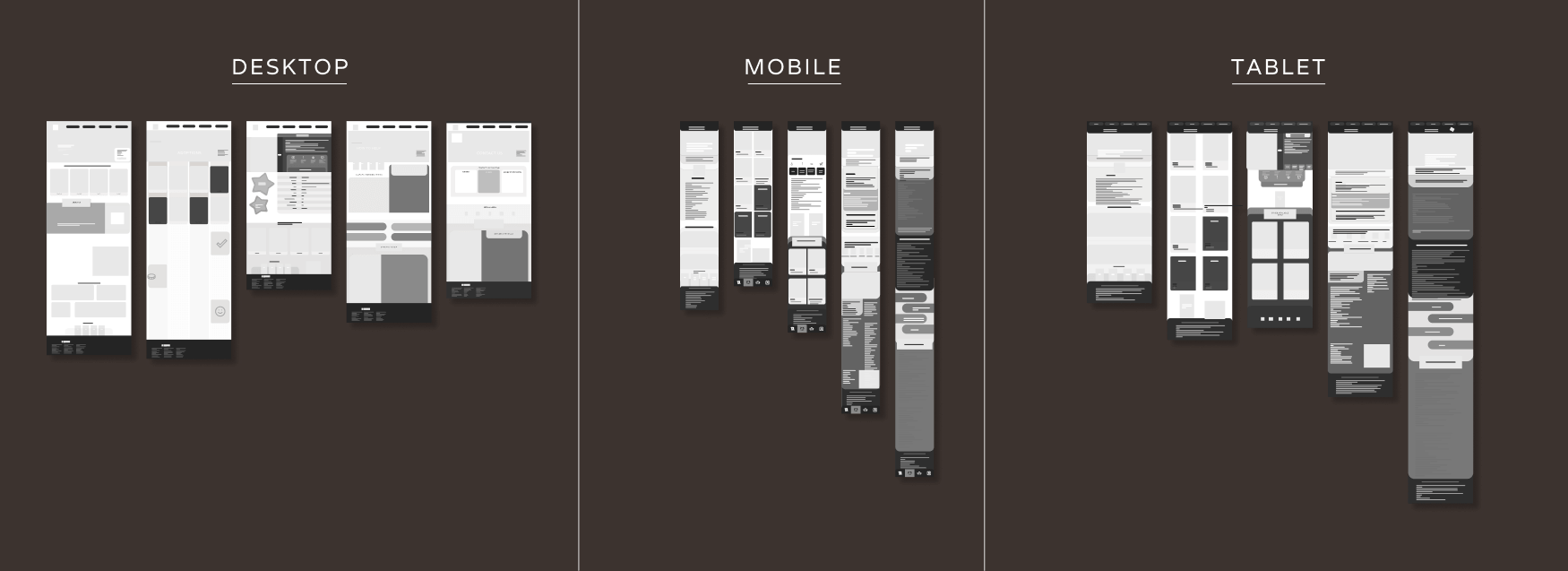
Users access the site across desktop, tablet, and mobile. My approach was to establish core elements that stay consistent across devices while adjusting proportions as needed, particularly on mobile where spacing requirements shift significantly.
The warm, approachable feel had to carry through every breakpoint. Rounded edges on background containers throughout the design create a softer visual language that keeps users at ease regardless of screen size.
LOW + MID-FIDELITIES
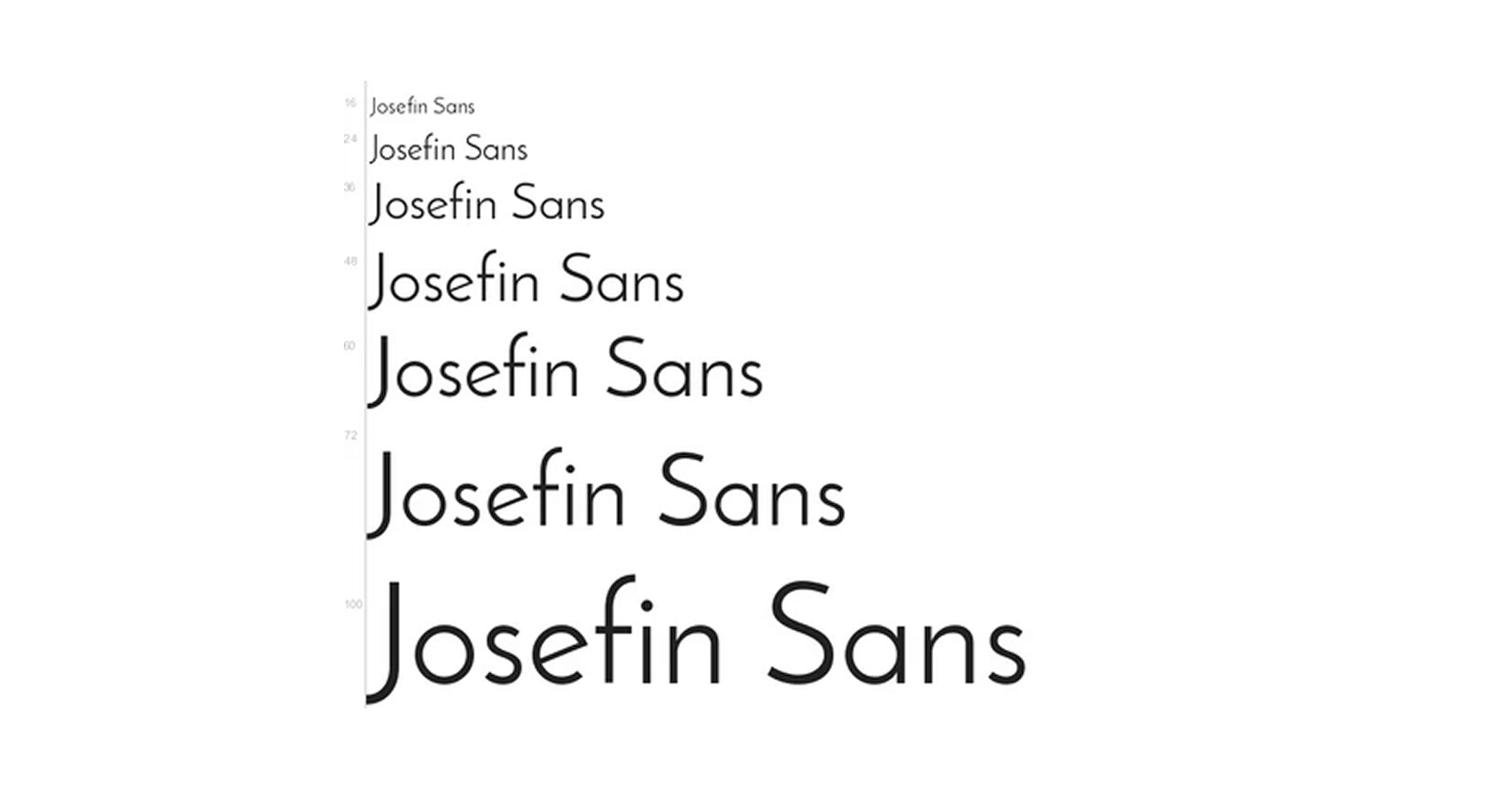
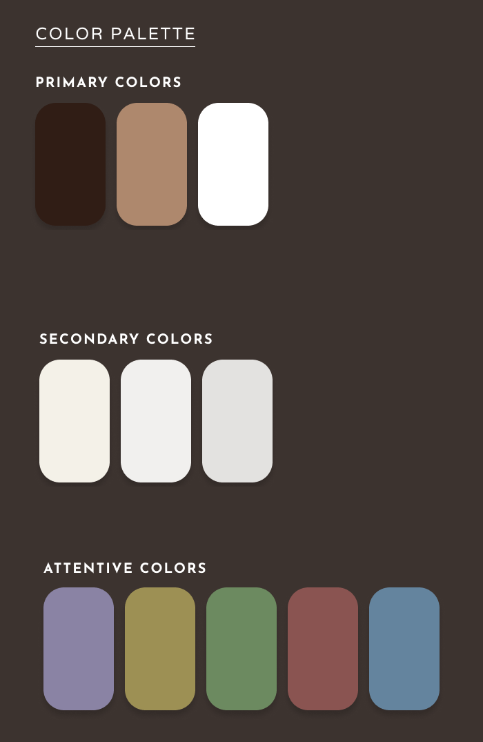
The original website had inconsistent typography across pages, which disrupted readability and the overall user experience. I selected Josefin Sans as a unified typeface for its clarity and soft aesthetic. While the original color palette conveyed warmth, many sections lacked visual distinction, so I introduced higher contrast and assigned color meaning throughout the site. Red-based tones represent adoptable dogs, while blue-based tones are tied to informational content, with subtle shifts where additional differentiation was needed.
THEMES & MICRO-INTERACTIONS
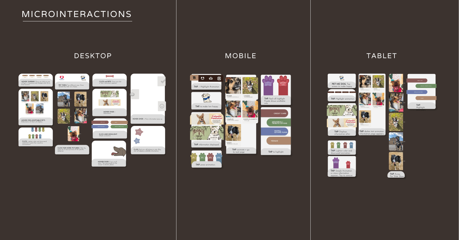
To enhance engagement, I created dog-related micro-interactions that add a playful, dynamic touch to the browsing experience. These elements blend organic and modern animation styles, maintaining the site's warmth while keeping users aware they're interacting with a digital interface. This balance supports the emotional nature of adoption decisions. Consistent interaction patterns across devices reduce cognitive load and build familiarity, while small moments of delight make the experience feel personal rather than transactional, reinforcing both usability and brand identity.
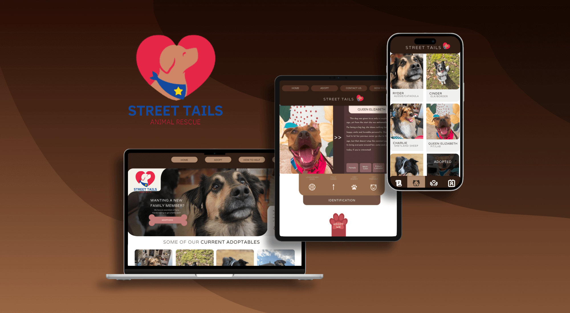
CROSS DEVICE LAYOUT
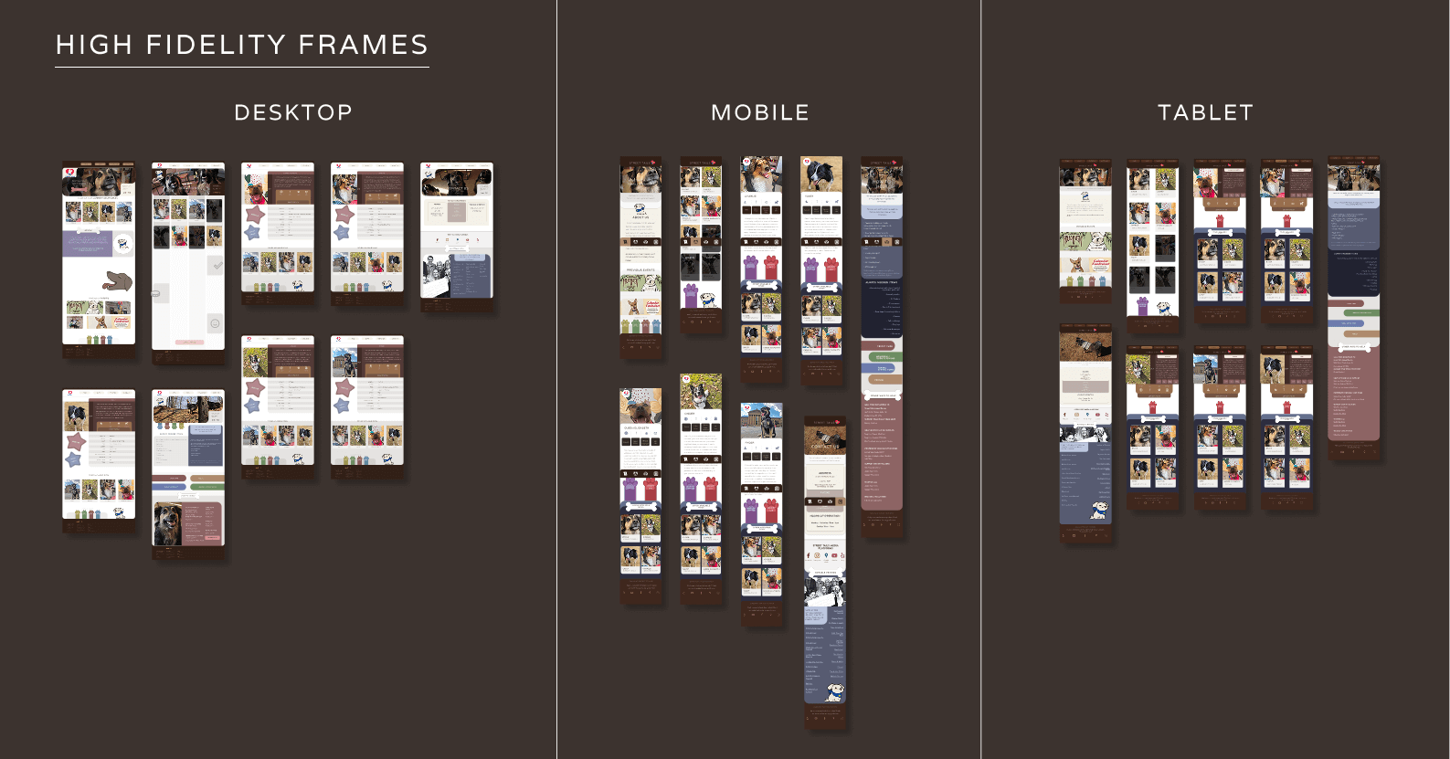
The final layouts maintain consistent color, imagery, text, and micro-interactions across all devices while respecting each platform's unique characteristics.
Desktop takes advantage of the larger screen for a more interactive experience.
Mobile repositions the taskbar to the bottom and incorporates scrollable animations for an app-like feel, with simplified elements and larger text to prevent cognitive overload.
Tablet strikes a balance between both, using a desktop-style taskbar while relying on tap and scroll interactions like mobile since tablets lack hover states.
Keeping core elements consistent across platforms helps users navigate efficiently while preserving the warm, emotionally engaging theme throughout.
HEURISTICS
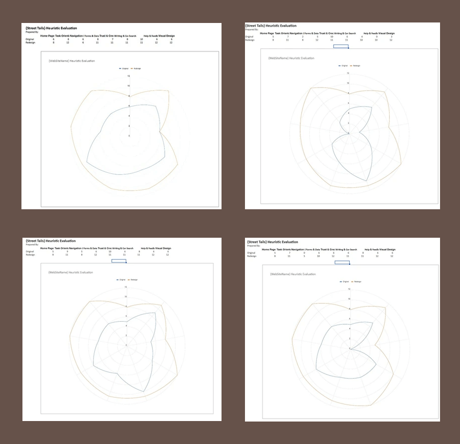
During heuristic evaluation, participants agreed that switching from the original brown and tan background to white improved readability and information processing. This change still allowed for animations, illustrations, and content while maintaining the warm atmosphere central to the site's purpose. Viewers noted that the graphical elements made the redesign feel less rigid than the original.
CONCLUSION
Evaluation charts confirmed the final design successfully balanced visual appeal with emotional engagement, creating an effective platform for pet adoption. When colleagues compared my redesign to the original site, the majority agreed with the improvements outlined throughout this case study. The videos here demonstrate the site's functionality in action.