TO DO INTERACTION DESIGN
INTERACTION DESIGN, WIRE FLOW, REDESIGN
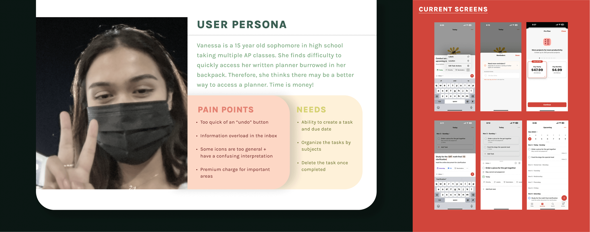
This project explored interaction design principles through rebranding Todoist, a popular task management app. The goal was to improve usability and engagement by emphasizing simplicity and feedback, ultimately reducing cognitive load for a broader range of users.
OVERVIEW
THE PROBLEM
Building a recipe site with 40+ recipes as individual HTML files would mean duplicating the same layout dozens of times. Any design change would require editing every single page. I needed a system where content lived separately from presentation, and pages built themselves from data. This is where PHP and MySQL come into light.
WIREFRAMES & WIREFLOW
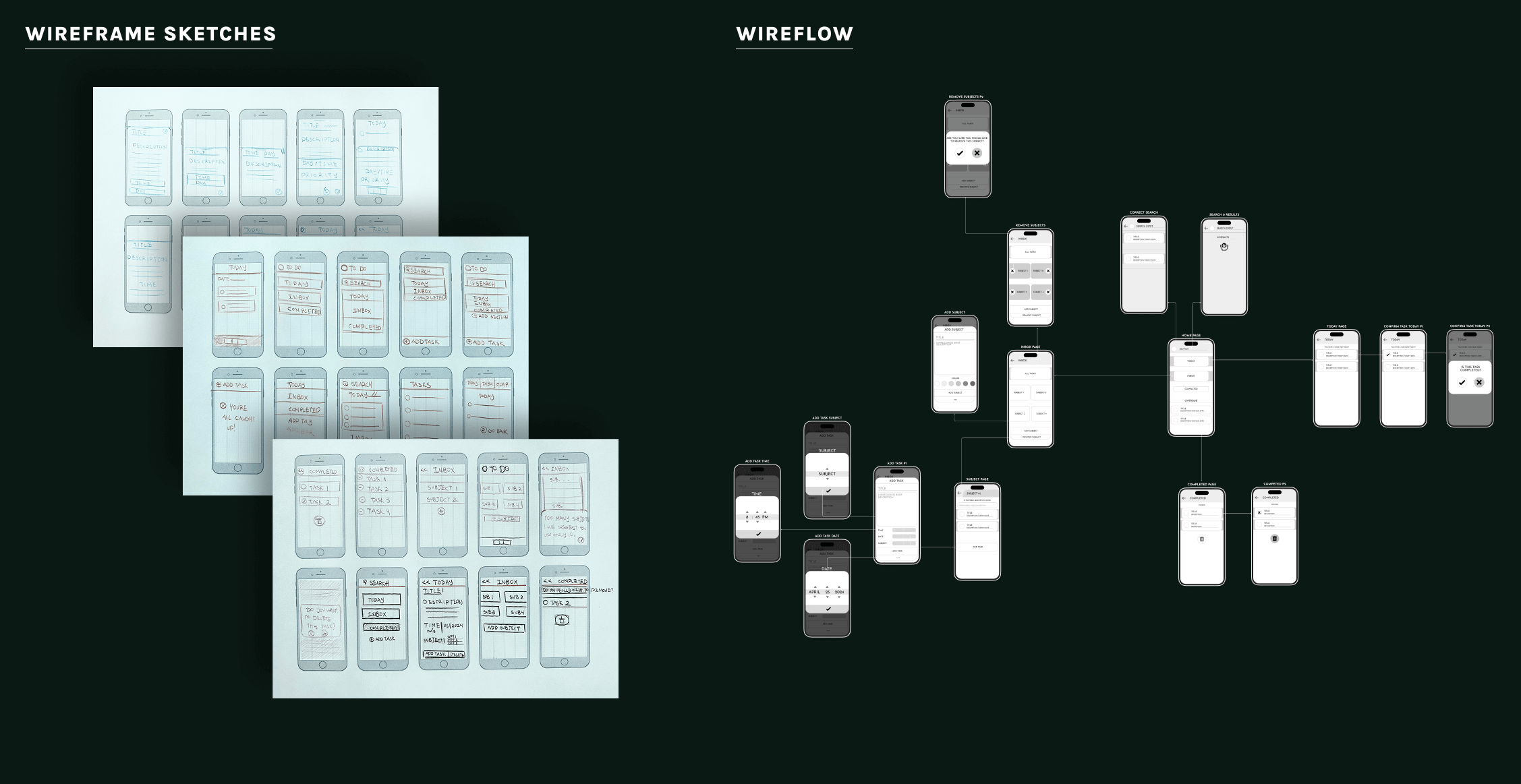
To make the app accessible to users not accustomed to cognitively demanding interfaces, I established a simplified layout:
Larger button padding for enhanced touch accuracy across devices
Relocated and streamlined task bar to reduce mental load
Simplified feedback system for more efficient action-response cycles
Added visual symbols for clearer understanding of actions
Implemented undo functionality for incorrect actions
VISUAL DESIGN REBRAND
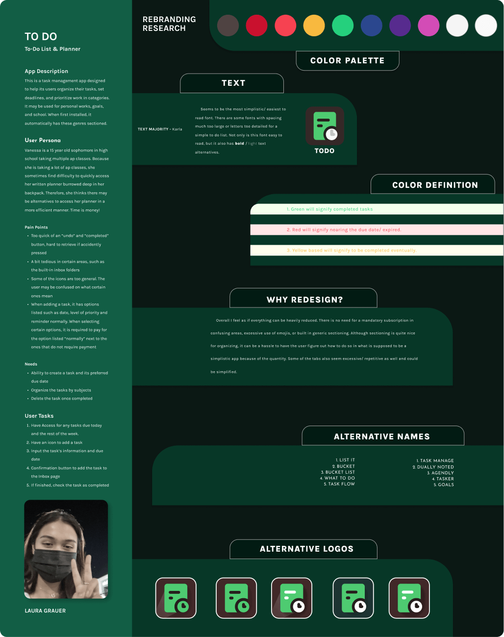
The rebrand retained valuable elements from the original (like saturated colors against a neutral background) while making strategic changes:
Color Shift: Primary color changed from red to green, which carries more positive associations
Expanded Palette: More color options allow users to associate specific colors with subjects, making tasks easier to locate
Simplified Text: Reduced text complexity for quicker scanning
New Logo: A note page design with clock icon, reflecting the organic to-do list concept and time-based nature of tasks
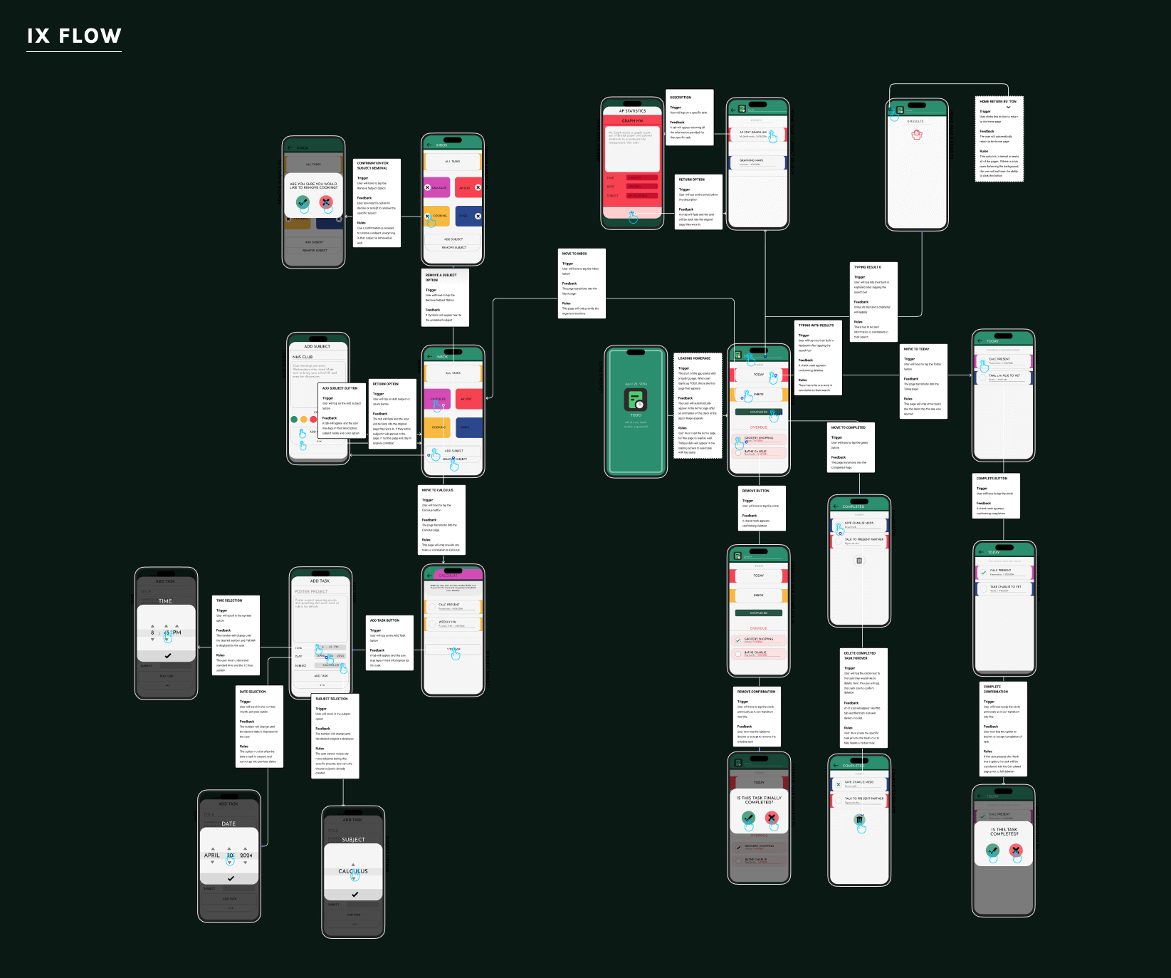
IX FLOW
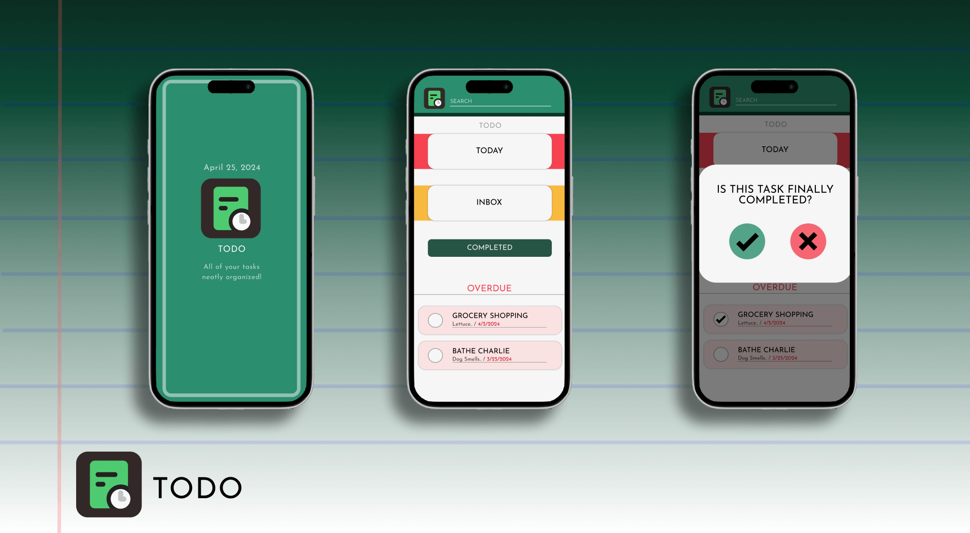
Search & Selection - The search bar sits at the top for clear affordance. Results display clickable options, and selecting a task triggers a color-coordinated description box that fills the screen for focused viewing.
Completing Tasks - Tapping the circle beside a task triggers a checkmark and confirmation modal. Once confirmed, the task fades, shifts to the completed section, and remaining tasks adjust position—providing clear feedback. An X icon allows users to cancel if tapped accidentally.
Managing Subjects - Subject groups are managed from the homepage. Users can add subjects with customizable titles, descriptions, and colors (six options available), with the background updating immediately to preview selections. Removing subjects triggers adjacent groups to fill empty space.
Task Organization - Clicking any subject opens its dedicated folder. Users can add tasks with title, description, date, and time fields—and transfer tasks to different subjects if needed.
CONCLUSION
Using Figma, Premiere Pro, Photoshop, and Adobe Illustrator, I developed the final animation for the rebranded app. This version showcases a to-do list that removes unnecessary elements, incorporates a more contrasting color palette, and enhances micro-interactions to create a more engaging user experience.
Overall, the rebranding results in a simplified to-do list that prioritizes clarity and usability. This also caters more to users who prefer a more simplistic task management app while still giving certain specific task options implemented into the design.