OVERVIEW
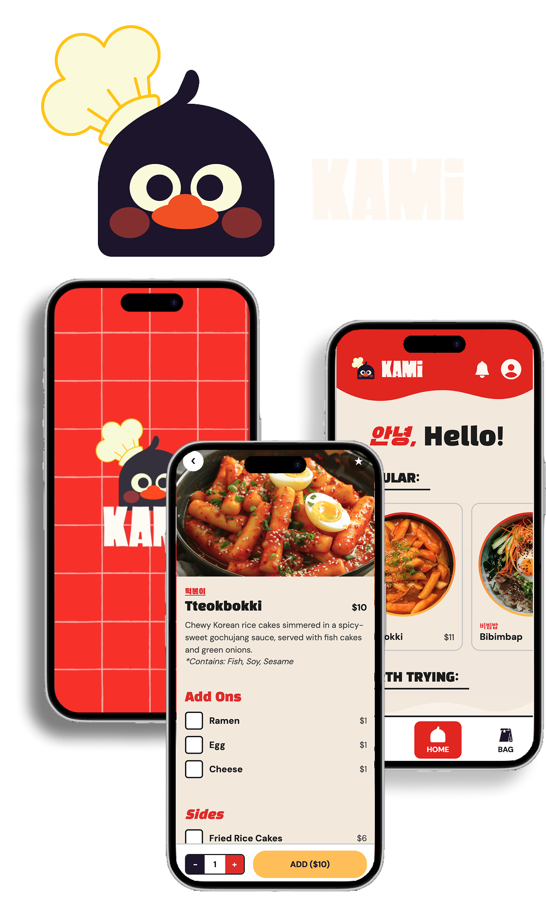
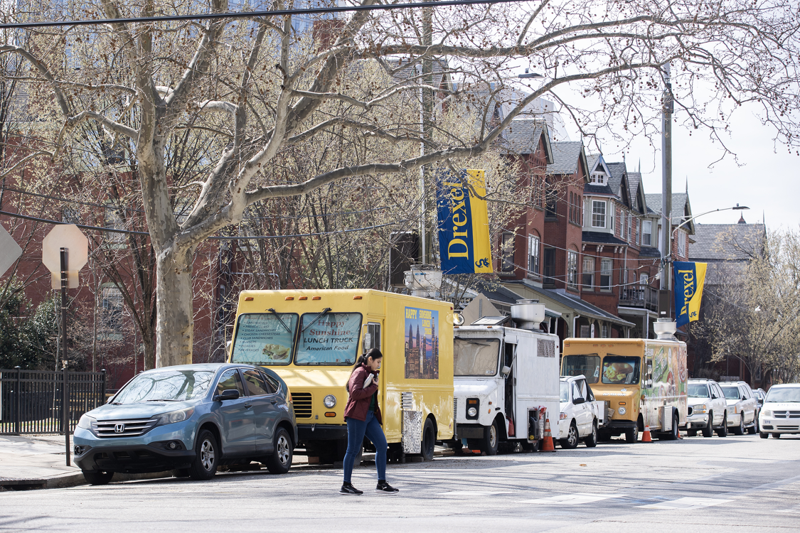
Kami is a Korean food truck on Drexel's campus and one of the only Asian food trucks in the area. This case study covers two design iterations: a 10-week initial concept and a follow-up redesign sprint preparing the app for a real PHP and CSS build where I became the Project Manager. Both phases shared the same goal: reduce ordering friction, keep users informed, and create an experience as welcoming as the food truck itself.
THE CHALLENGE
Without a dedicated ordering app, customers wait in long lines with no visibility into wait times and have to check Instagram just to find out if the truck is even open. Three pain points emerged consistently across research:
- Long wait times during peak hours
- No real-time updates on truck availability
- A customizable menu that was difficult to translate into a clean app flow
COMPETITORS
Kami's biggest differentiator was being the only Korean food truck in the area, which naturally limited direct competition. Still, a clear trend emerged from analyzing nearby trucks: the ones performing best had clean menus with strong food photography, making the ordering process faster and more visual.
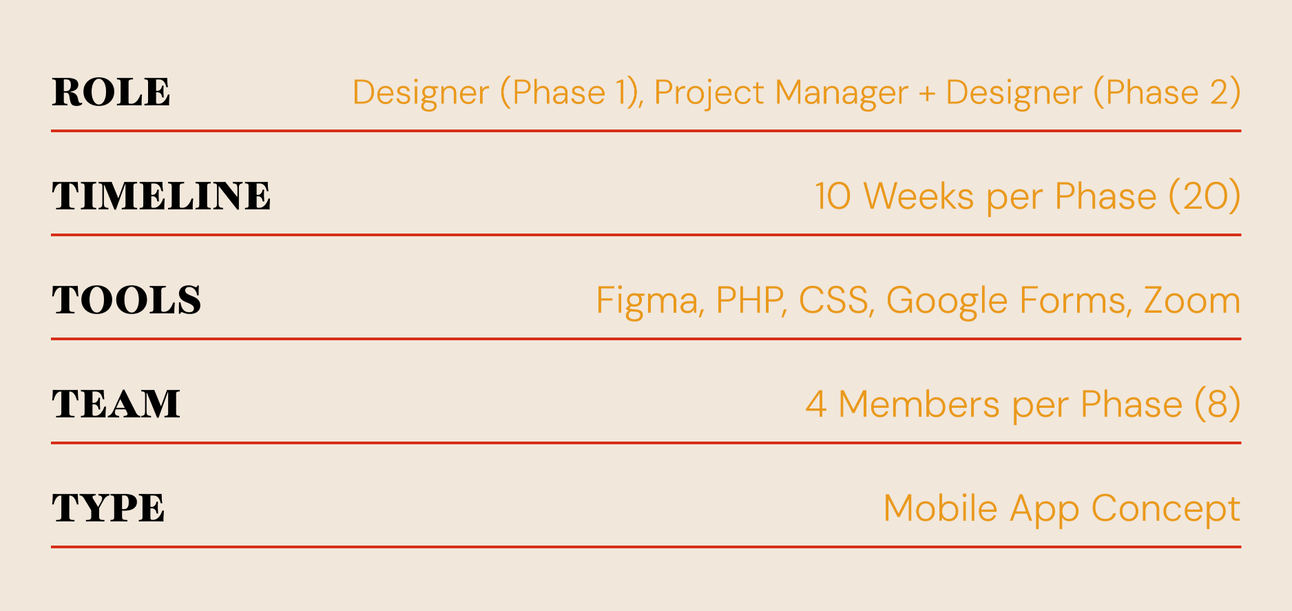
ROLE
Phase 1: Equal partner on a four-person team. Conducted visual observations, customer interviews, and usability testing over 10 weeks with no budget.
Phase 2: Project Manager and designer. Focused on closing usability gaps and preparing the design for development.
Success targets: 4/5 average in usability testing and users completing orders without confusion.
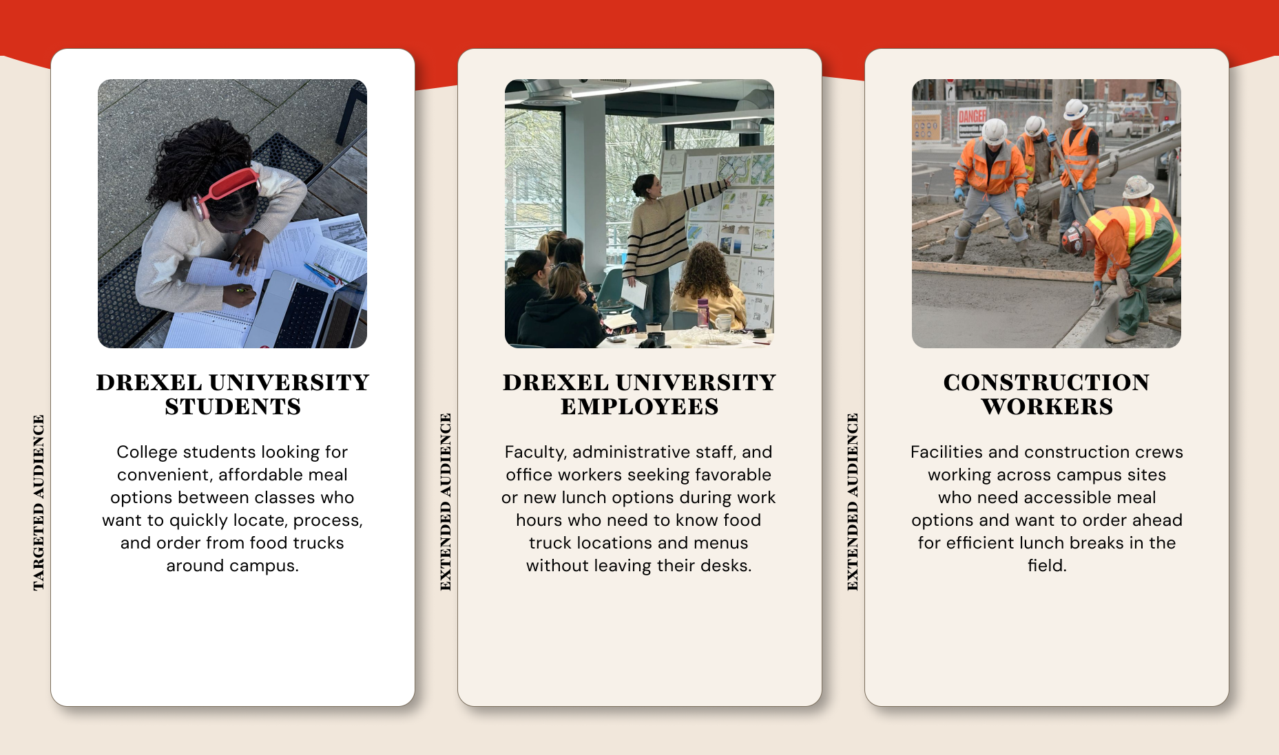
AUDIENCES
Customer interviews shaped three user personas across both phases:
- Drexel students: primary audience
- Faculty and staff
- Nearby workers
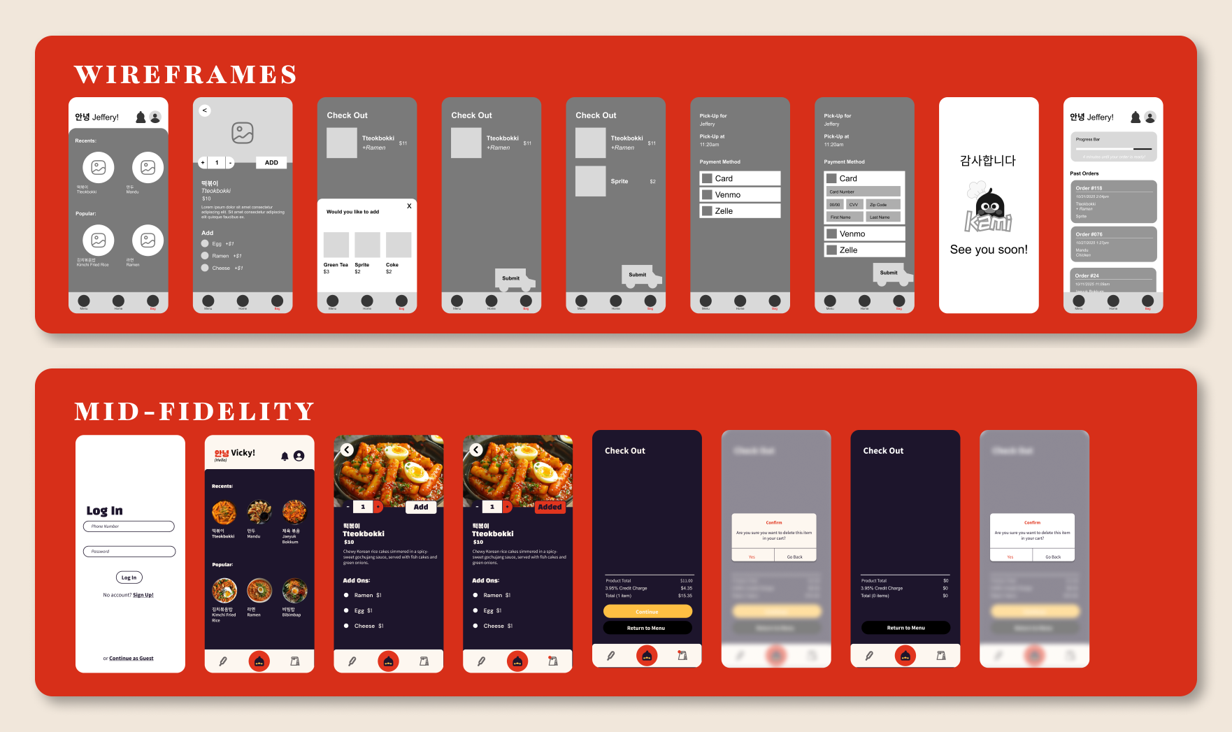
DESIGN PROCESS
Very early on usability tests on low and mid-fidelity prototypes surfaced four consistent issues: layouts were too complex, food photos were too small, pickup times were missing, and the dark color scheme felt too intense. These findings drove every decision going into high-fidelity.
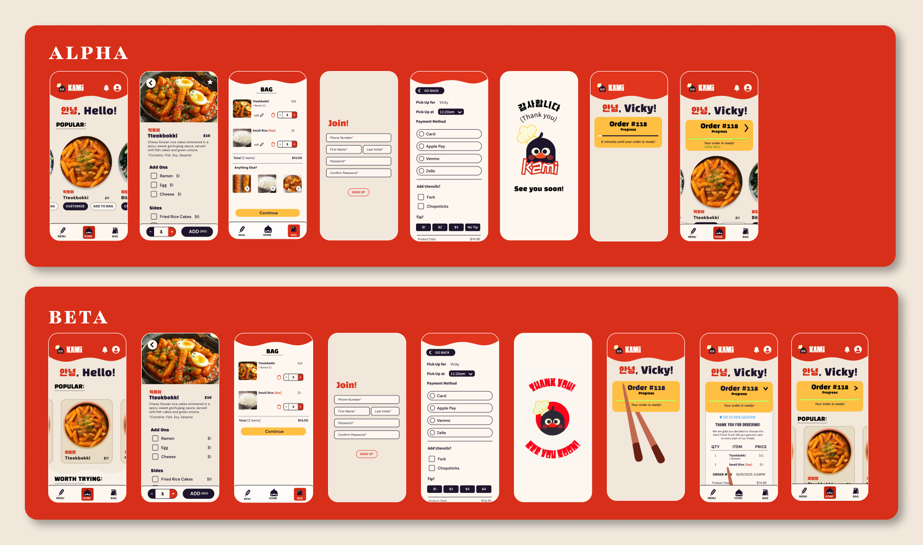
In Phase 2, usability tests were run on alpha and beta versions of the CSS-coded app. My design partner and I alternated between facilitating and note-taking. After each round, findings were synthesized as a team and proposed changes were reviewed with developers before the next round began.
ALL PHASES KEY DECISIONS
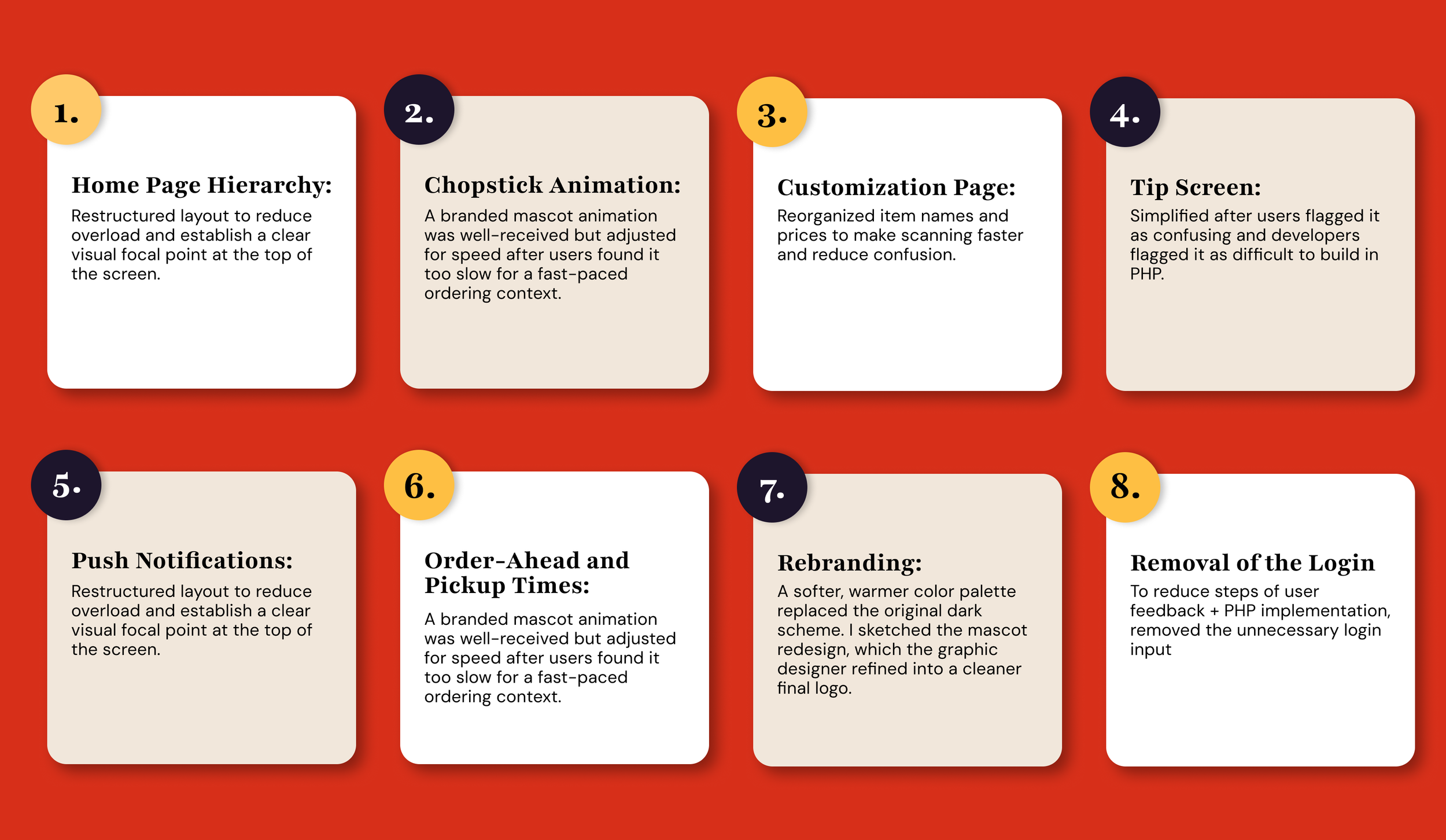
Research findings shaped eight key design decisions across both phases of the project.
RESULTS
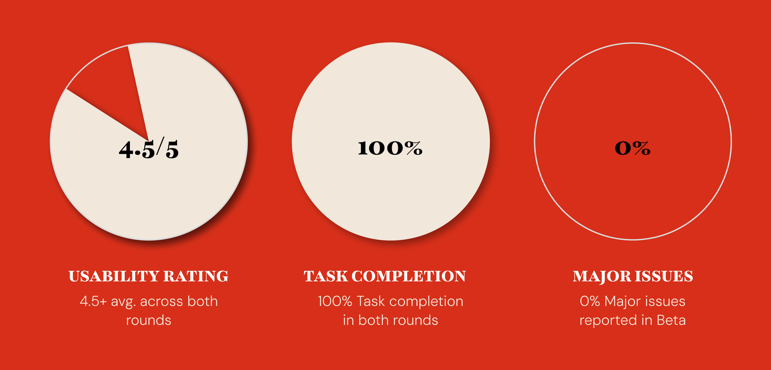
Usability testing averaged 4.5 out of 5 in the beta round, clearing the 4/5 target
Most participants completed the ordering flow without major confusion
Final round feedback centered on minor spacing preferences, not structural issues
CONCLUSION
Our final design directly addresses every pain point uncovered in research. Users grew irritated of the confusing navigation. Now, the navigation was simplified and the option of add ons was altered to make the process much less of a hassle. Long wait times discouraged repeat visits. The app lets users order ahead and see estimated pickup times. Inconsistent Instagram communication frustrated loyal fans. Push notifications now alert users to closures and updates instantly.
By grounding every design decision in user research, we transformed frustrations into features. The result is an app that doesn't just let you order Korean food. It makes the entire Kami experience smoother, more reliable, and more delightful.