
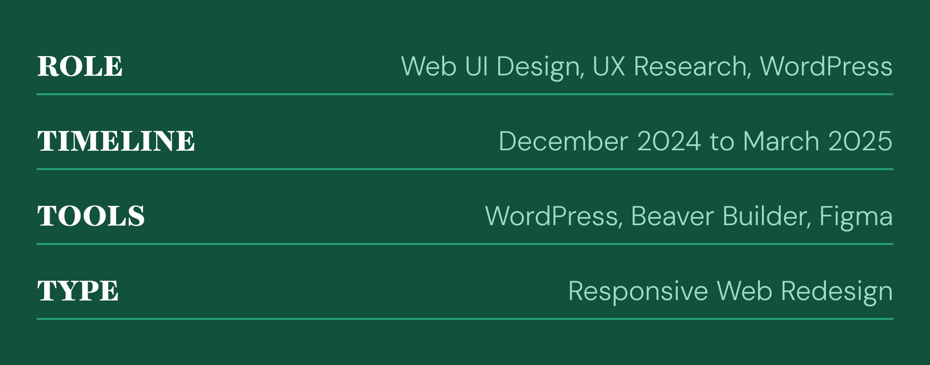
OVERVIEW
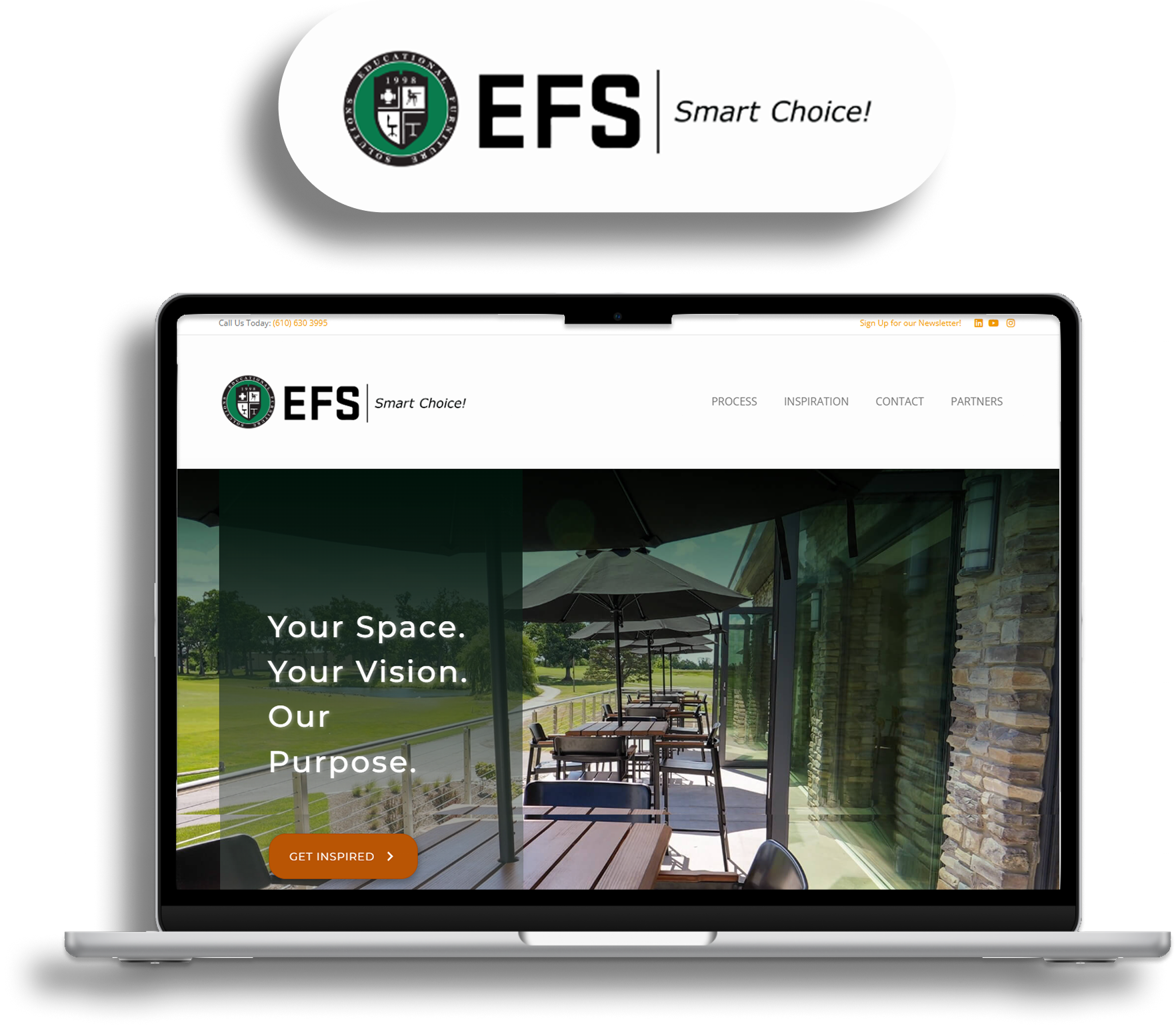
EFS LLC primarily serves as a furniture design and manufacturing company. Because potential customers typically spend only a few seconds scanning a homepage, it was crucial to redesign the site for clarity, visual engagement, and concise communication.
My goal during this redesign was to modernize the interface while maintaining EFS LLC's straightforward professionalism.
KEY CHALLENGES
The previous site was highly simplistic with minimal feedback interactions. While functional, it lacked clear hierarchy and efficient navigation flow. Users could move from point A to point B, but often struggled to locate what they were looking for quickly.
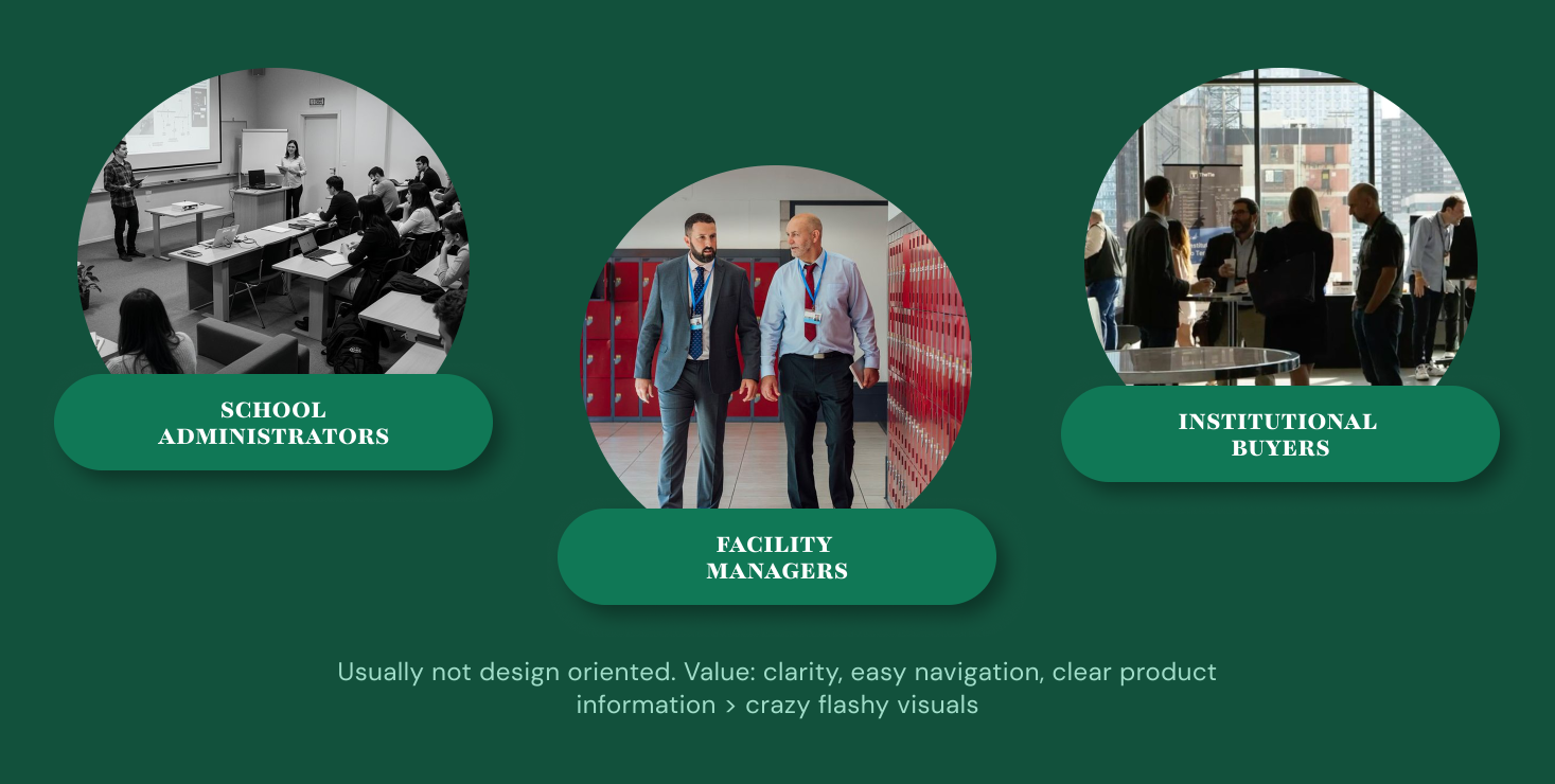
GENERAL USERS
EFS LLC's primary users include school administrators, facility managers, and institutional buyers looking for durable, functional furniture for classrooms, offices, and public spaces. Many of these users are not design oriented; they value clarity, easy navigation, and clear product information over flashy visuals.
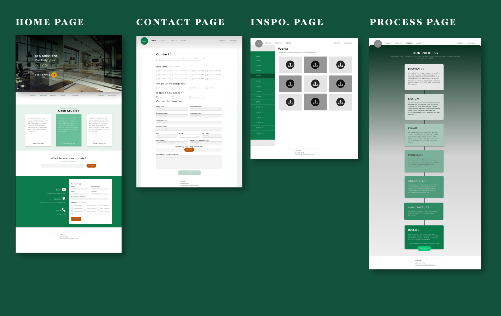
INTRO WIREFRAMING
The wire framing phase went through several rounds of edits and feedback. Early on, it became clear that the client's vision was still somewhat undefined. They had ideas of what they liked but weren't entirely sure how to structure it. During this phase, it became vital to improve the navigation flow and prioritize certain areas of the site more.
ALPHA TESTING
During this state, I began testing for any aspects to improve towards the general flow of the site prior to the change on the site itself. As a result, several minor edits were used during this development stage to pave the road to a better final product.
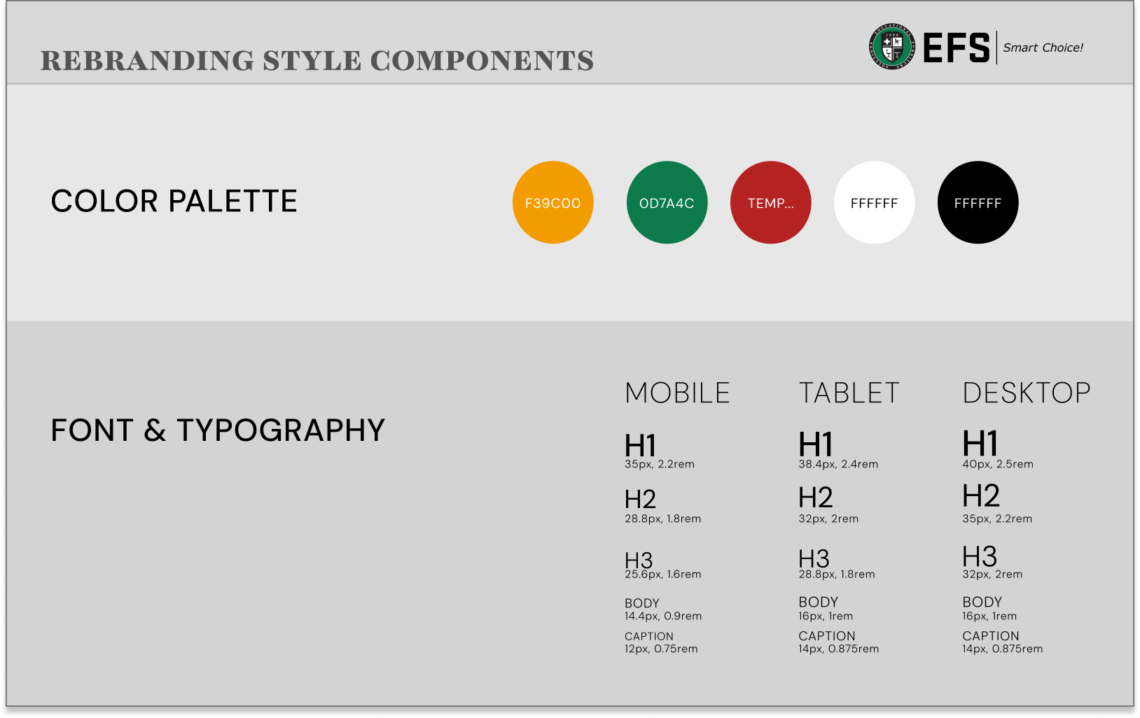
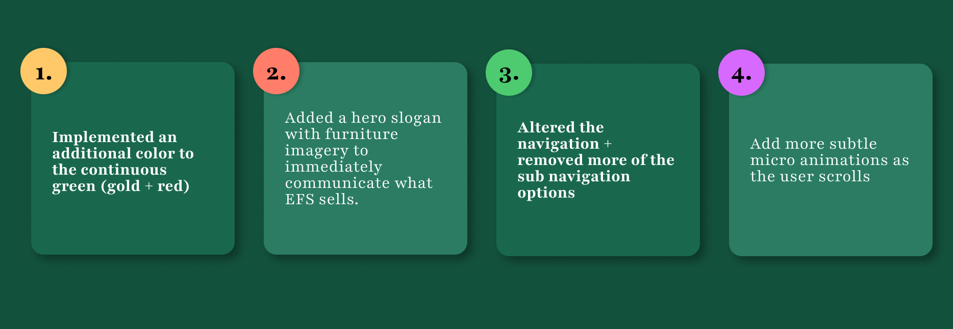
SLIGHT REBRANDING
EFS's signature green was enhanced with a gold accent to highlight calls-to-action and key details. Since EFS frequently works with schools and colleges, approachable animations were added to bring warmth without sacrificing professionalism.
Color: Enhanced brand green with gold confirmation accent
Typography: Responsive heading hierarchy (H1 through H3) optimized across devices
Motion: Subtle scroll animations with Lottie animations on the process page
WORDPRESS CLEANUP
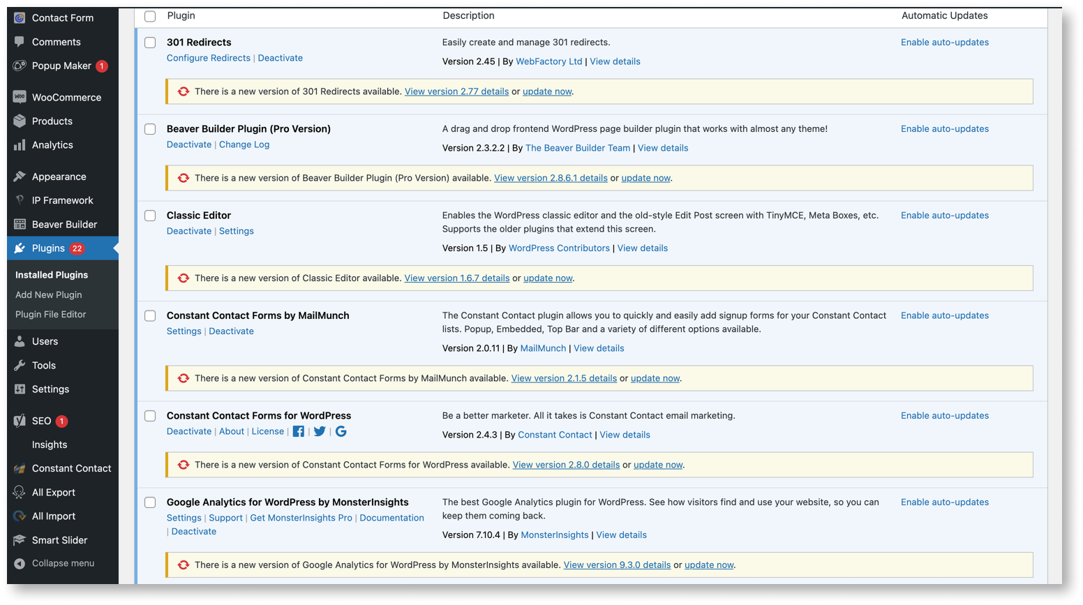
EFS was already using Beaver Builder but the setup lacked a reusable base. I built 10+ custom components with responsive layouts and mobile compatibility as editable foundations the team could duplicate without risk of breaking the site.
The existing WordPress backend was overloaded with unnecessary files and outdated plugins, so unused assets were removed, 1,000+ redundant images compressed, and the client was guided through maintenance practices to keep the site running efficiently.
KEY OUTCOMES
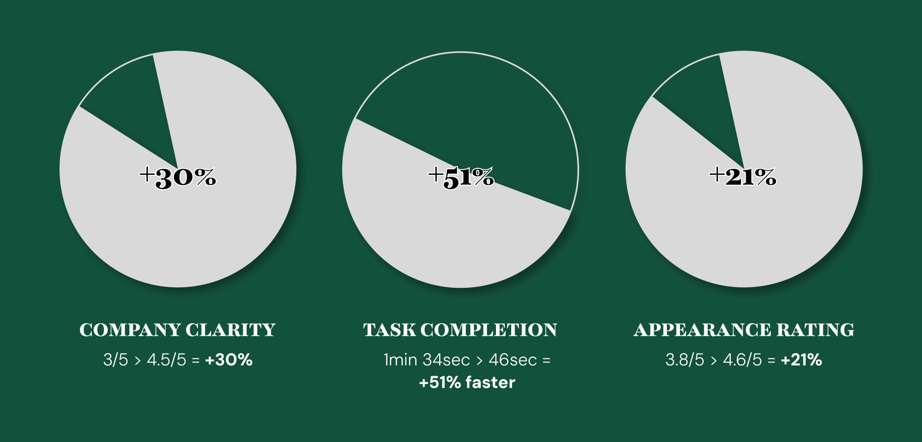
Overall, users called the updated site "self-explanatory" and responded positively to the animations and consistency across pages. When compared to the previous testing, there was a further increase of overall satisfaction.
FINAL SITE CONCLUSION
The final site achieved a strong balance between simplicity and usability. Collaboration with the client was essential and we worked closely to ensure the final product reflected both their goals and the needs of their audience.
The redesigned site now loads faster, features an improved visual hierarchy, and communicates the brand's professionalism more clearly.