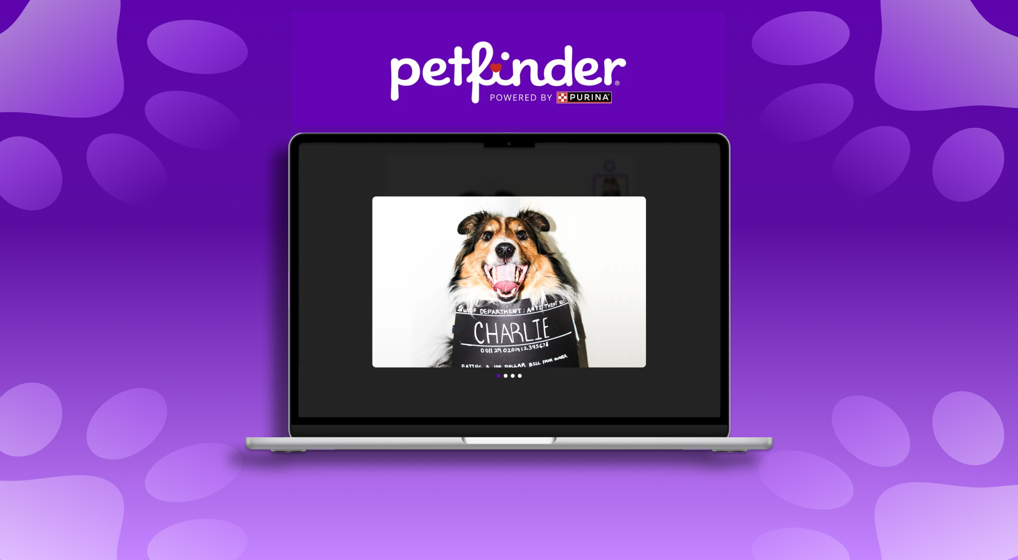
PETFINDER MICRO-INTERACTIONS
CSS/HTML, ANALYSIS, PUSH
OVERVIEW
Although straightforward once clicked, the original Petfinder dog slideshow lacked warmth, intuitive navigation, and consistent animation states, giving users little guidance to explore. A later site update further fragmented the layout with misaligned elements and irregular spacing, reinforcing the need for a more structured interaction model. Over ten weeks, I redesigned an HTML-based prototype focused on a friendlier, dog-centered experience by introducing softer transitions, paw-shaped navigation controls, a restructured layout, and playful animations across five interactive models. These changes transform the slideshow into an exploratory moment that encourages users to meaningfully interact with breed visuals rather than simply scrolling past them.
CONTEXT & CHALLENGES
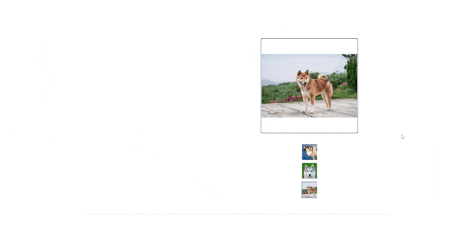
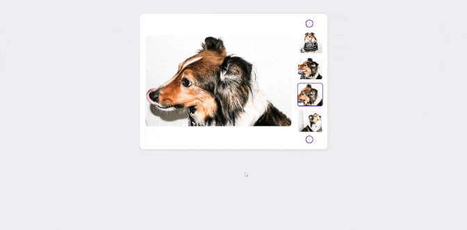
While the slideshow technically displays imagery, the thumbnail area lacks clear affordance, giving users little indication that the gallery can be interacted with beyond the cursor changing to a pointer. Interaction states are also inconsistent. Certain elements trigger animations while others remain static. Clicking on the main image or the close (X) button results in no transitional feedback, yet clicking on the arrows or thumbnails triggers a slide animation. This uneven behavior may create abrupt transitions that interrupt the expected continuity of the interaction, making the slideshow feel partially unfinished rather than intentional. The primary goal of this project is to transform an underdeveloped interaction into a more polished experience that better aligns with the emotional tone of viewing and learning about a dog breed.
BACKGROUND
GOALS & OBJECTIVES
Key indicators defined by measurable improvements would be the increased animation across the images and reduced single image exits; overall though, a more consistent user progression with proper formatting would encourage continued browsing rather than stopping after the initial view. Ensuring that each interaction state responds in a predictable manner would also reinforce the indented experience. These enhancements would not only improve usability but also support a stronger emotional connection with the content.
Petfinder's specific dog breed page serves as a quick informational entry point for users researching a particular breed with a possible adoption consideration taken into account. The original slideshow provided visual reference, but did so with unclear navigation and inconsistent motion cues; this can result in a disengaging experience. Over the course of 10 weeks, the purpose of this redesign was to evaluate and enhance the micro interaction within the slideshow section so users would feel encouraged to browse, interact, and understand the image and the concept of the breed.
PROCESS & INSIGHTS
Because Petfinder attracts a wide range of users, from casual scrollers to potential adopters, I created a primary user persona, Trish Martin, to anchor all design decisions. Trish’s calm, practical browsing habits highlighted the need for an interface that felt intuitive, gentle, and emotionally warm rather than abrupt or technical. Her frustrations with unclear navigation and inconsistent visual feedback directly informed the redesign direction.
USER PERSONA
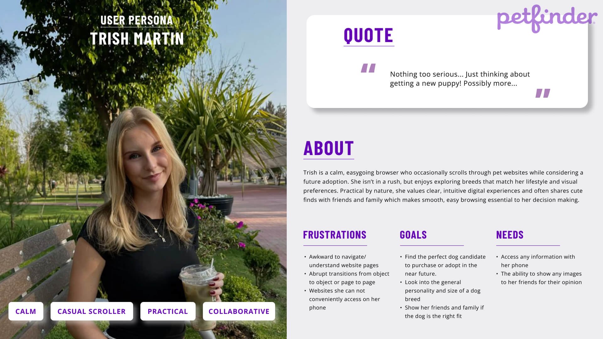
Because Petfinder attracts a wide range of users, from casual scrollers to potential adopters, I created a primary user persona, Trish Martin, to anchor all design decisions. Trish’s calm, practical browsing habits highlighted the need for an interface that felt intuitive, gentle, and emotionally warm rather than abrupt or technical. Her frustrations with unclear navigation and inconsistent visual feedback directly informed the redesign direction.
STYLE SHEET
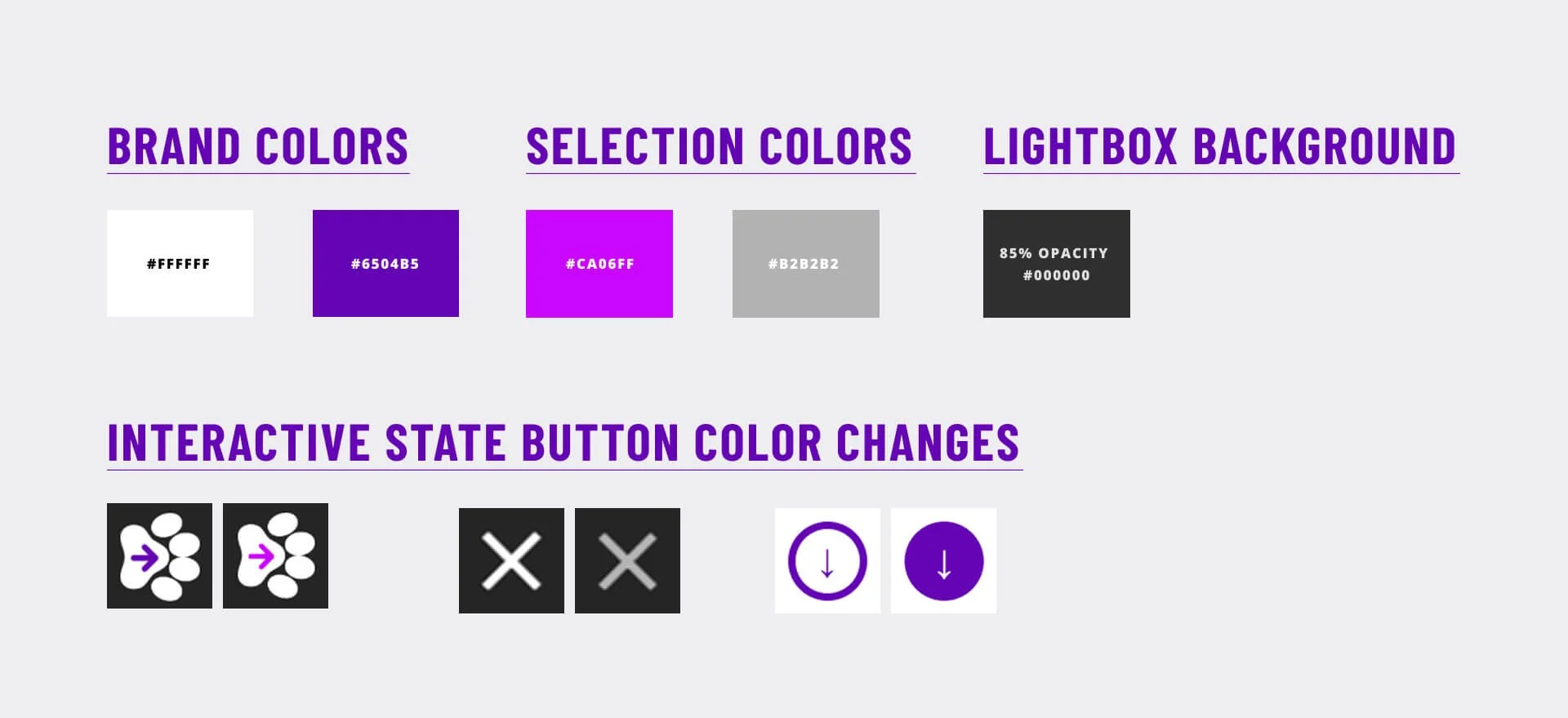
Using the original Petfinder color palette is vital because it preserves brand recognition and visual continuity across the entire experience. Since users already associate Petfinder’s signature colors with pet related browsing, maintaining that palette ensures the redesigned slideshow feels native to the platform rather than an external addition. I expanded on this by incorporating more of the original colors directly into the micro interactions and the objects themselves. Subtle shifts to lighter and darker variations of Petfinder’s core hues were used to indicate hover, active, and click states, creating clearer behavioral feedback while still remaining true to the brand. This approach strengthens both usability and emotional consistency, helping users feel grounded in the familiar Petfinder environment.
UX FLOW
I mapped a simple user journey that followed Trish’s behavior:
Browse → Notice image → Hover/Click → Enter Lightbox → Navigate thumbnails → Exit → Share
A better understanding of the journey map was essential for me to break down the slideshow into individual steps to analyze as separate objects. Instead of looking at the overall section as a big, vague experience, a journey map would let me see exactly where things could stay as is or needed improvement.
THE SOLUTION
Again, a need for a consistent use of animations were needed to create clearer feedback and a more intuitive browsing experience.
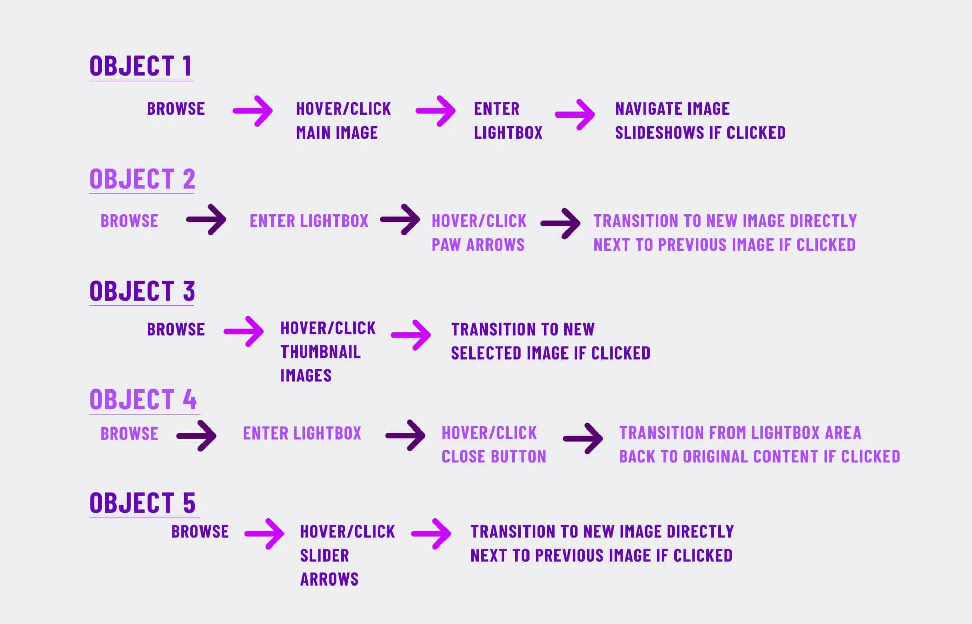
OBJECT 1. MAIN LARGE IMAGE
Changes -
Reconstructed the layout of the thumbnails and main image by resizing the main for more primary focus
Added hover states that slightly scale and brighten the image
Added a click interaction that expands the image into the lightbox and animates upward
Why - Previously, the interaction relied solely on a cursor change to communicate click ability, which offered minimal visual feedback and could easily be overlooked. The large image is the primary focus of the user. By providing a scaling and brightness visual change cue alongside the change of the cursor to the pointer during the hover state, it communicates to the user that the image is clickable. When clicked, the upward movement and fade transition reinforces that the user is shifting into a focused viewing state in a playful pet centric manner.
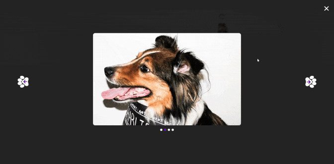
OBJECT 2. LIGHT BOX ARROWS
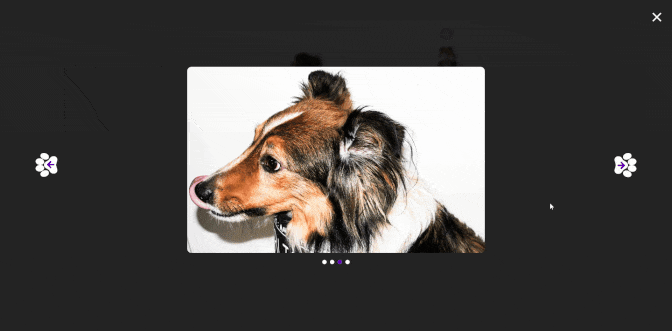
Changes -
Positioned paw shaped arrows with more of a gap between them and the focused image
Added hover animation with increased brightness
Implemented fade and bounce/rotation effects when clicked
Why - Previously, a simple slide animation displayed when the arrow was clicked. With the improvements, the simple arrows were now paw shaped with an animated bounce effect when clicked to consistently provide a pet focused theme. The arrow movement reinforces a cause and effect relationship to help users understand that the view will shift in response to their action.
OBJECT 3. X/CLOSE BUTTON
Changes -
Designed opacity changes on hover
Added movement and rotation on click
Why- Closing the gallery previously felt abrupt, with no visual cue other than the cursor to pointer change. By animating the X, fading the gallery, and returning to the main view with a progressive shift, the exit action feels intentional rather than harsh. Users retain context because the lightbox fades back into the original image rather than resetting entirely.
OBJECT 4. SLIDER NAV ARROW

Changes -
Implemented slider arrows visible above/below thumbnails on desktop and sideways on mobile
Added scaling and color inversion on hover
Linked every click to the active image state
Why - The original site lacked explicit navigation controls, offering no clear way to move through the slideshow beyond a hover cursor change. The updated design implements slider navigation arrows that provide a more clear spatial direction from image to image. These controls not only increase comprehension of the thumbnail area, but also gives users a direct agency in choosing where to go next rather than relying on guessing.
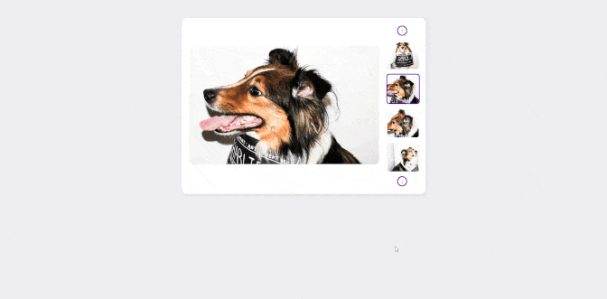
OBJECT 5. THUMBNAIL SLIDER IMAGES

Changes -
Added hover scaling
Highlighted active selection with a colored border
Synced their state to the main image fade
Why - Thumbnails serve as previews, so interaction must visually confirm selection. The purple border and fade transition ensure that users always understand which image is currently active. The hover scaling adds a tactile quality that matches the rest of the object animations in an engaging and intentionally consistent manner.
OVERALL…
Across all five objects, the intention was to create a continuous, motion based interaction system. This is to be driven by a more emotionally oriented user experience that aligns with the playful, pet centered nature of the content.
CONCLUSION
The redesigned slideshow addresses the primary goals of improving affordance, emotional tone, and interaction consistency. By implementing clear navigation cues, predictable animation states, and a more visually engaging structure, the prototype demonstrated measurable improvements in user progression through the gallery. Through this process, I learned the importance of breaking an interaction into smaller components before attempting to solve the larger visual behavior.
Mapping the user journey and assigning personality to the persona provided clearer direction for the micro interactions, and analyzing each object individually made it easier to maintain consistency across the entire system. In the near future, I plan to expand on this by refining animation/transition timing to correlate with the user's experience.